06 July 2014

Better visualizations with Tableau Public

Spreadsheet-generated charts can be useful, but there too many times where better types of visualization are required. Fortunately, there are many options out there, but I find Tableau to be an excellent choice. Tableau Public is a great way to train yourself on its many possibilities.

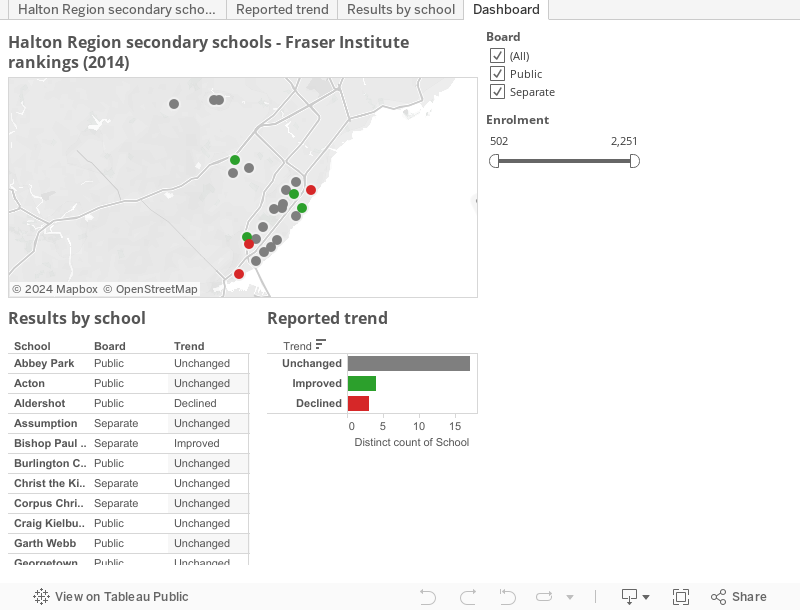
Let's take some public data to analyze:

  • Rankings of all secondary schools in my home region (Halton),
  • that can be segregated by size of school enrolment and type of school board,
  • mapped out geographically on a map,
  • with identified trends for outcomes, as determined by the Fraser Institute, for 2014.

Here is a small demonstration of what can be done:


I leave it to you to investigate this more, and be amazed at what options are available.

No comments:

Post a Comment

Why don't Canadian businesses invest?

The tendency of Canadian businesses to under-invest has been noted for decades, and the Fraser Institute reported in 2017 that investment f...